INTERIOR MAGAZINE
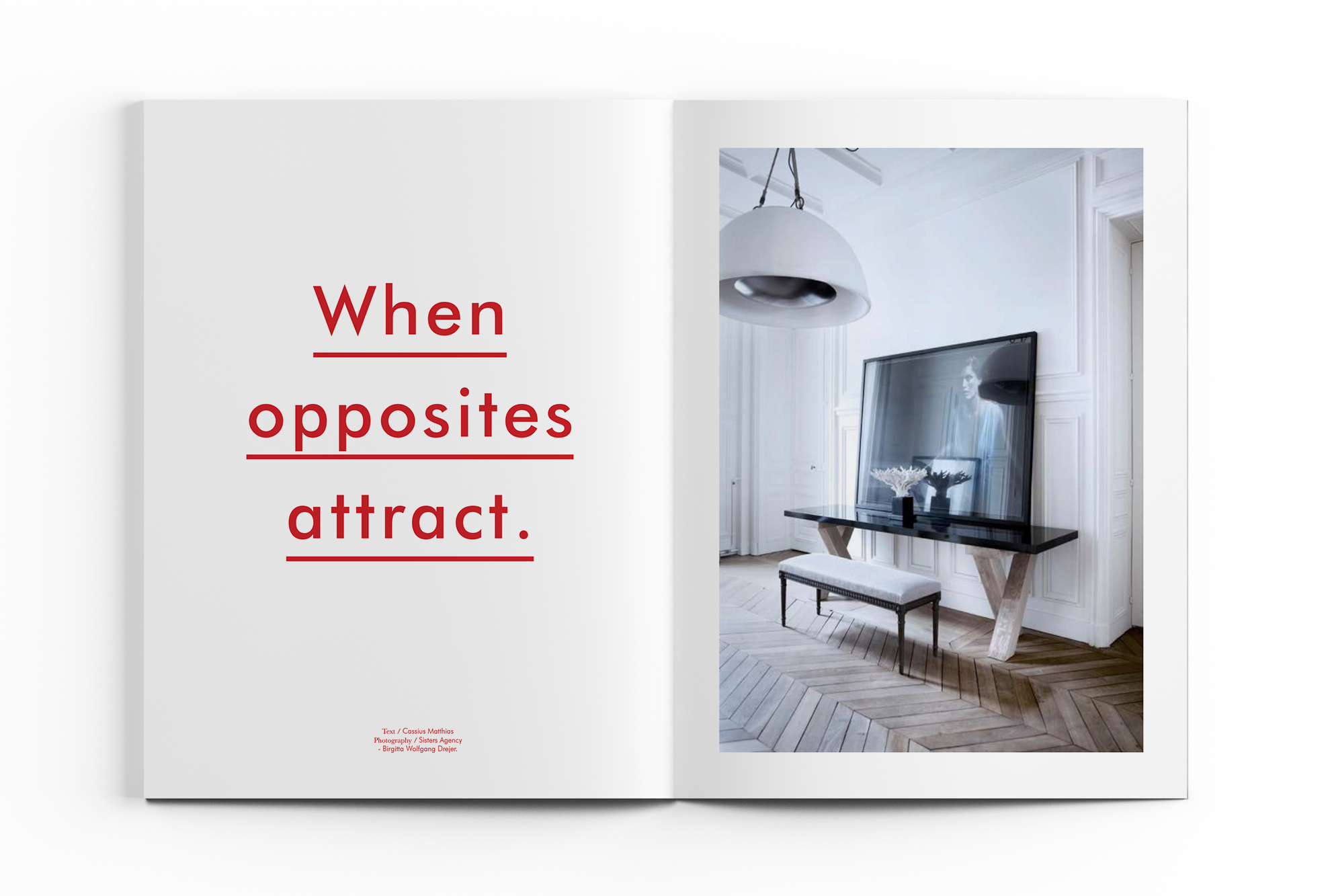
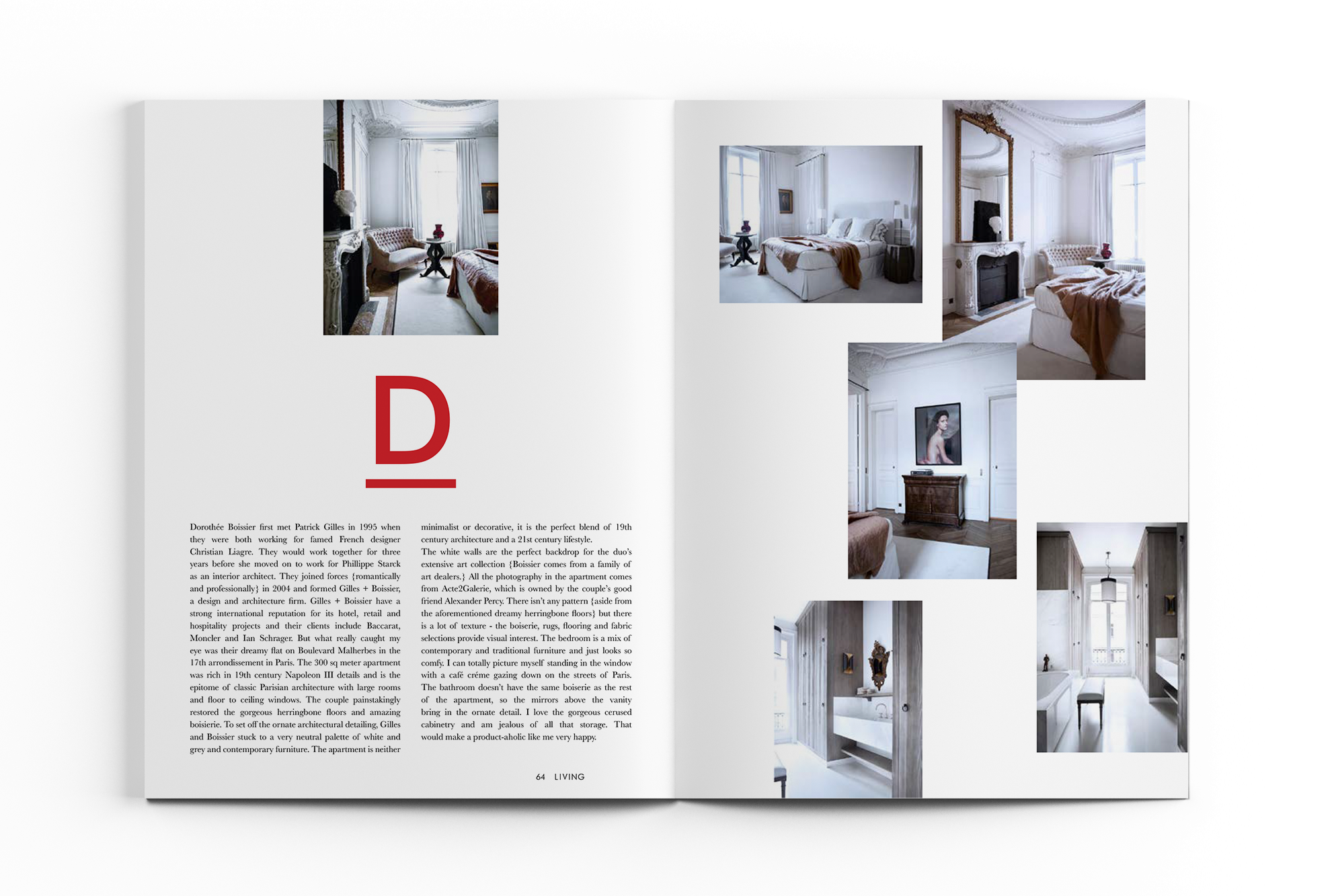
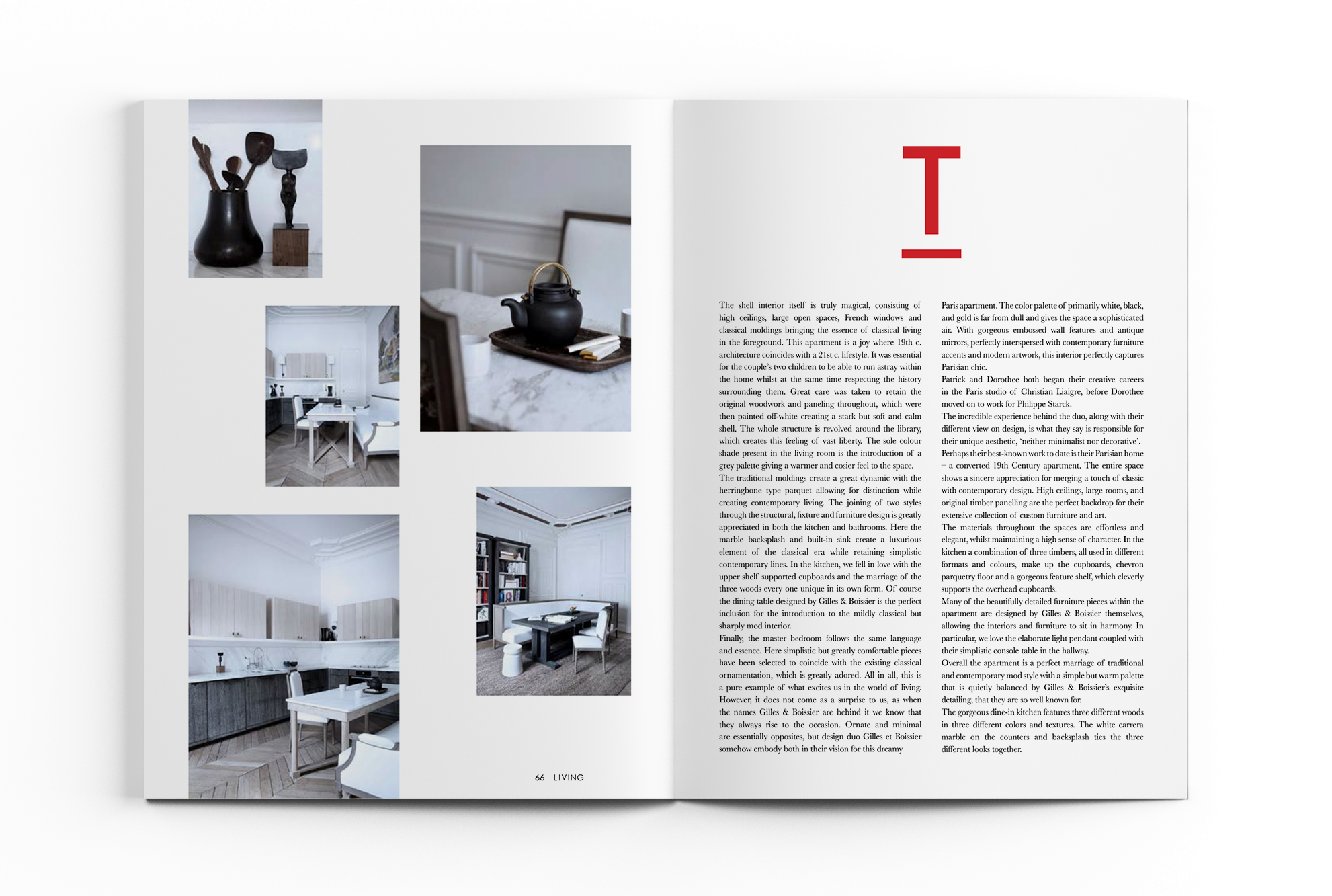
Personal project: a fourteen-page long article designed for the interior design column of a high-end lifestyle magazine. The goal was to make spreads that represent a progressive, clean, edgy style and resonate with the title of the article. As the title was “When opposites attract”, I tried to use a lot of contrast (symmetrical vs. asymmetrical layouts, empty vs. busy areas on spreads, contrast in font usage: small size black serif for body copy vs. vivid red sans seriff headings, subheadings and quotes, etc) and put text over imagery to symbolise attraction.


